This site is for educational purposes and is not an operational business.


Why Page Speed Matters More Than Most People Realize
By Isaac Graves
Last Updated: 12/10/2025
(content created with AI assistance)
When people talk about web design, they usually focus on visuals: colors, layout, animations, all the fun stuff. But one of the most important parts of a high-performing website is something that isn’t visual at all: page speed. A fast website feels better to use, ranks better, and keeps people from bouncing. At Graves AI, this is a core part of how we build.
Why Page Speed Is a Big Deal
Users rarely wait longer than a few seconds for a site to load before leaving.
Search engines factor speed into rankings, so slower sites can get pushed down.
Faster sites create better engagement, stronger trust, and more conversions.
In other words, speed isn’t just a technical detail—it directly affects your business.
What Slows Websites Down
A lot of the problems behind slow websites are avoidable. The most common issues include:
Images that are way too large
Excessive third-party scripts
Weak hosting setups
Bloated CSS or JavaScript
Over-the-top animations or effects
At Graves AI, these things get addressed early so performance becomes part of the foundation, not an afterthought.
How to Improve Website Performance
These are widely recommended approaches that consistently help speed:
Compressing and resizing images
Using newer formats like WebP
Setting up proper caching
Minifying CSS, JavaScript, and HTML
Removing unnecessary plugins or code
Hosting on faster, optimized servers
This is the type of system-level thinking we build into every website.
Wrapping Up
A great design means nothing if the site loads slowly. Speed is a core part of the user experience and directly affects how people see your business. At Graves AI, we build websites that look sharp and perform reliably. Fast, clean, and optimized from the ground up.
Why Clear Navigation Is One of the Most Overlooked Parts of Good Web Design
By Isaac Graves
Last Updated: 12/10/2025
(content created with AI assistance)
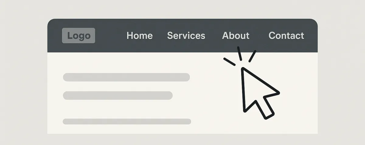
A lot of websites try to impress people with flashy sections, big animations, and trendy layouts. But one thing that makes or breaks the user experience is much simpler: navigation. If visitors can’t find what they’re looking for in a few seconds, they leave. At Graves AI, clean navigation is something we take seriously because it directly affects how people interact with your business.
Why Good Navigation Matters
Users expect to find core pages like Services, About, and Contact right where they assume they’ll be.
People make quick decisions based on how easy a site feels to use.
Clear navigation reduces frustration and increases conversions.
When navigation is clean and predictable, users feel comfortable and confident exploring your site.
What Causes Bad Navigation
Most navigation problems come from trying to do too much. Common issues include:
Overstuffed menus with too many options
Hidden menus that aren’t obvious to new visitors
Icons with no labels
Poor mobile menu structure
Pages buried multiple layers deep
At Graves AI, we design navigation that’s simple, intuitive, and consistent across desktop and mobile.
How to Build Strong Navigation
Here are widely recommended best practices that genuinely improve navigation:
Keep top-level menu items limited to the essentials
Use clear names, no guessing, no vague wording
Make sure the mobile menu matches the desktop structure
Put the most important links first
Always include a visible contact or call-to-action
Organize content into logical categories
Simple beats clever every time when it comes to navigation.
Final Thoughts
Clean navigation isn’t exciting on the surface, but it’s one of the biggest factors in how users experience your site. It shapes how people move, what they click, and how they feel using your business online. At Graves AI, we make sure the navigation is simple, intuitive, and built for the way real users think… not the way designers hope they think.